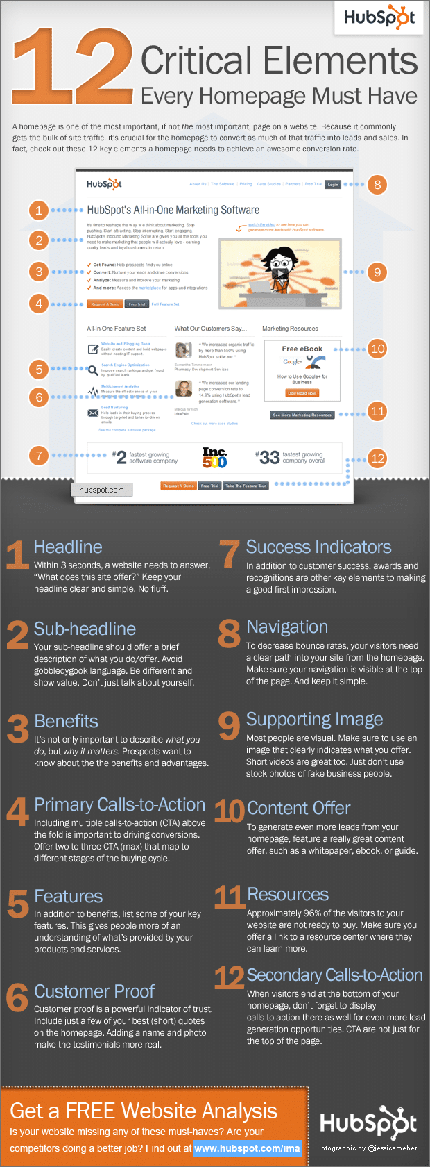
Whenever you launch a website, your main objective is probably to draw visitors in, regardless if it’s a lot of people or just a few. Designers have always faced the almost daunting task of optimizing a website to their best ability. The design has to be straightforward, clean, informative and instant. It’s not an easy task when you look at how much you usually want to pack into a website. If you have a lot of stuff to present, this task can even become almost impossible. Looking at it from the simplest perspective will allow you to sift through what is really necessary. The most critical elements should always be present on your website, no matter if you like them or not. A user needs a way to identify your content quickly and easily. But what are the critical elements of a website anyway?
There are of course many different ways to determine what the critical elements of a website are, but according to HubSpot‘s infographic called 12 Critical Elements Every Homepage Must Have, we are treated to some of the obvious ones. I call them obvious, but for some people, they might not come across that way.
It seems there are a lot of people out there who want to call themselves web designers, yet they don’t really know how to optimize a website when it comes to making it easy for visitors to navigate and find their way around a website. These 12 critical elements are well explained, and this is a great starting point when wire framing your website design.
If you are selling something on your website, it becomes even more important to look over your website structure. The slightest change can make your sales increase by 100% or more. I have personally seen this happen many times, and sometimes it’s just a matter of trial and error. Click heat maps are also a great way to see just how your visitors navigate your website and where their mouse is positioned most of the time when they are browsing your website.
There are plenty of these services available on the Internet, and most of them are free. So have a look at this great tool and implement these 12 critical elements right where you know your visitors are clicking, and you will see that with a little bit of tinkering you will increase those sales quite a bit.
An important factor to remember is also that visitor behavior is always changing. The Internet is an always morphing entity that will change any browser’s behavior on the Internet, and on your website as well. So keep track of what your visitors are doing, where they come from, and how you present your content, deals or information and you will most likely be able to marry the two over and over again to create the absolute best optimization for presenting these 12 critical elements on your website.

COMMENTS