We talk a lot about design here on Bit Rebels, and it’s something that we love with a passion. We’ve touched on pretty much every subject you can think of through the years, and we are looking forward to writing even more about it. The awesome part about design is that it’s almost infinite what can be called design. It’s a resource that can’t be depleted no matter how much you try. The funny thing is that people are bringing design to new levels each and every day, and the more minimalistic it is, the more brilliant it becomes in the eyes of a lot of people. However, is there a point when design just isn’t design anymore?
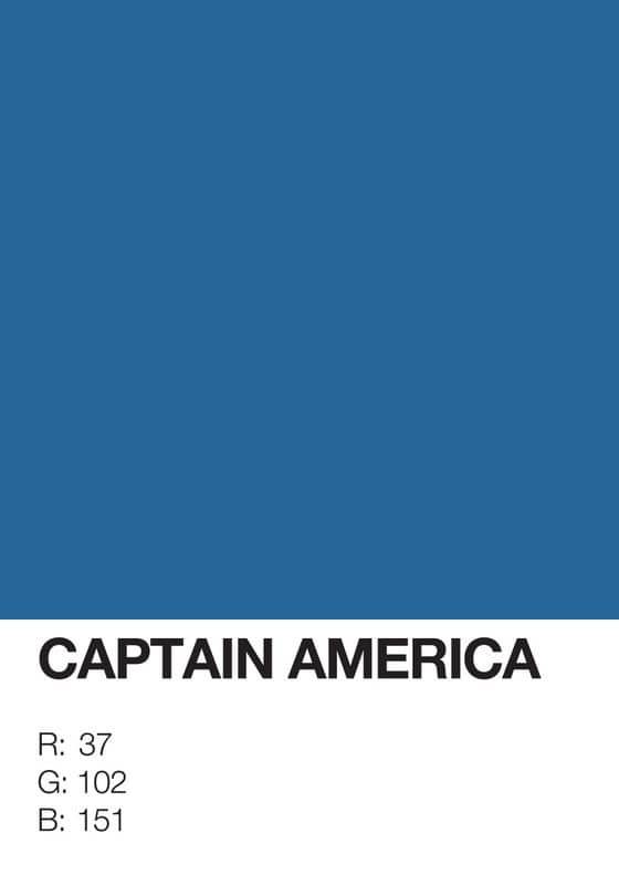
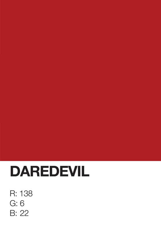
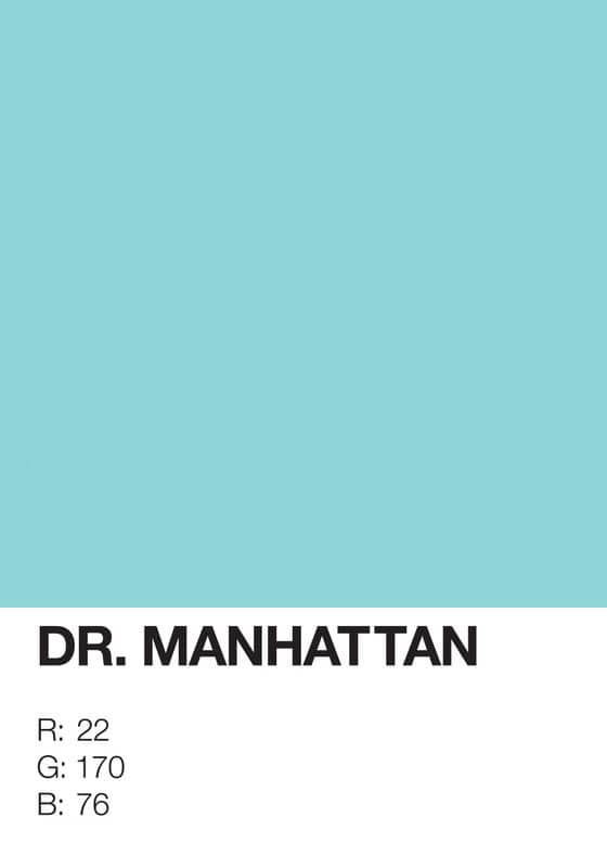
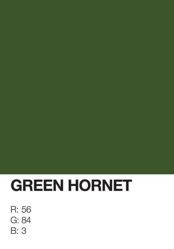
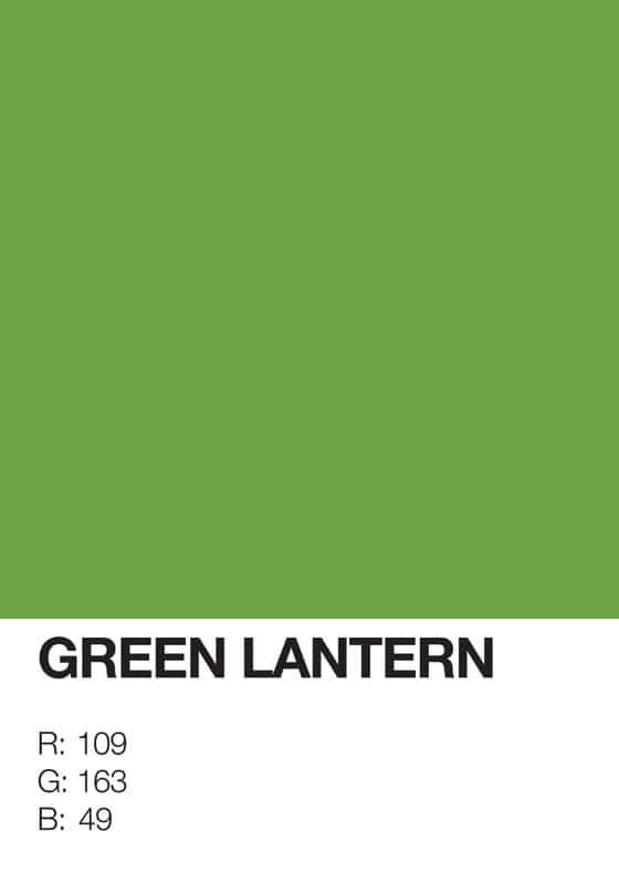
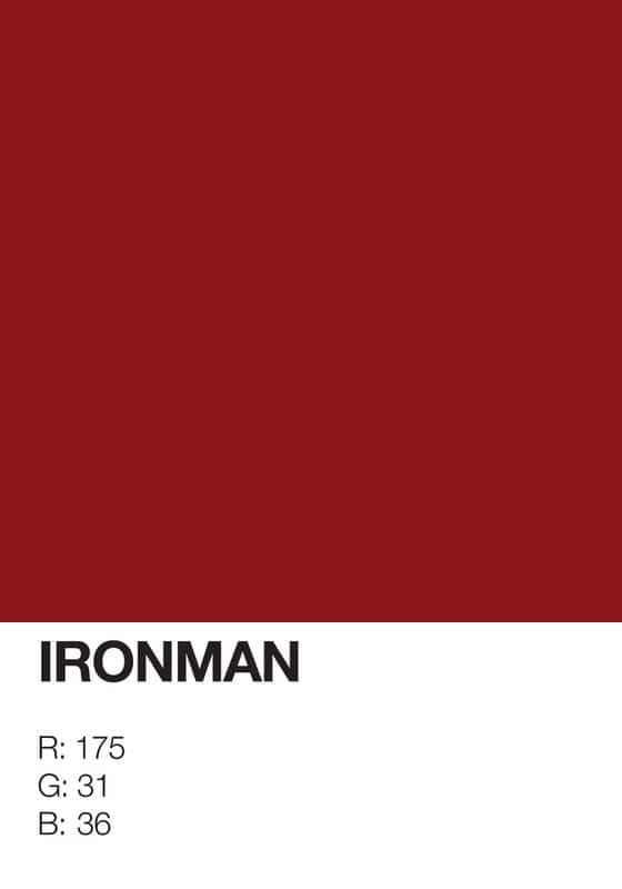
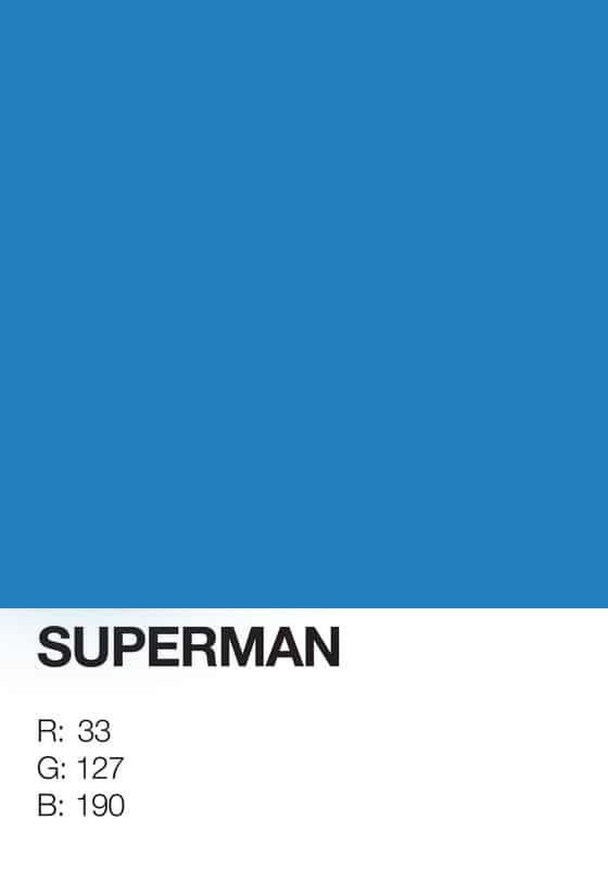
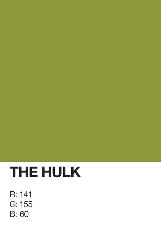
I am sure a lot of you readers will find this thing either completely brilliant or completely stupid. But no matter how you look at it, it’s still design, at least to some extent. This particular “artwork” comes from the brain of Gidi Vigo and could be described as being a lot of things. The idea is to take the absolute essence of superheroes and create the very most minimalistic poster designs possible out of that.
I have to agree that the brain is a powerful thing when it comes to imagining things. With just a color, a name and some numbers, you are able to picture the whole Superhero based on pretty much nothing at all. It’s just how the brain works I guess, and if this thing is going to work for you, it pretty much requires that you have come across one or more of these superheroes at some point in your life. If you have, this will totally makes sense. If not, it’s bad luck I guess.
Via: [UFunk – French]

COMMENTS