The power of ubiquitous connectivity means that website design is about so much more than aesthetics; it is a core element of a company’s branding, a way to connect with the target audience, and an important part of a company’s profitability. In the research study Trust and Mistrust of Online Health Sites, web designer Joseph Putman notes that design is more important than content in questions of trust. Web design should be colorful and dynamic but simple to navigate, loading times should be fast, and pop-ups should be kept to a minimum. If you are planning on launching a new website in 2019, take note of the following trends, which may help increase customer confidence and establish your website as one to visit many times over.
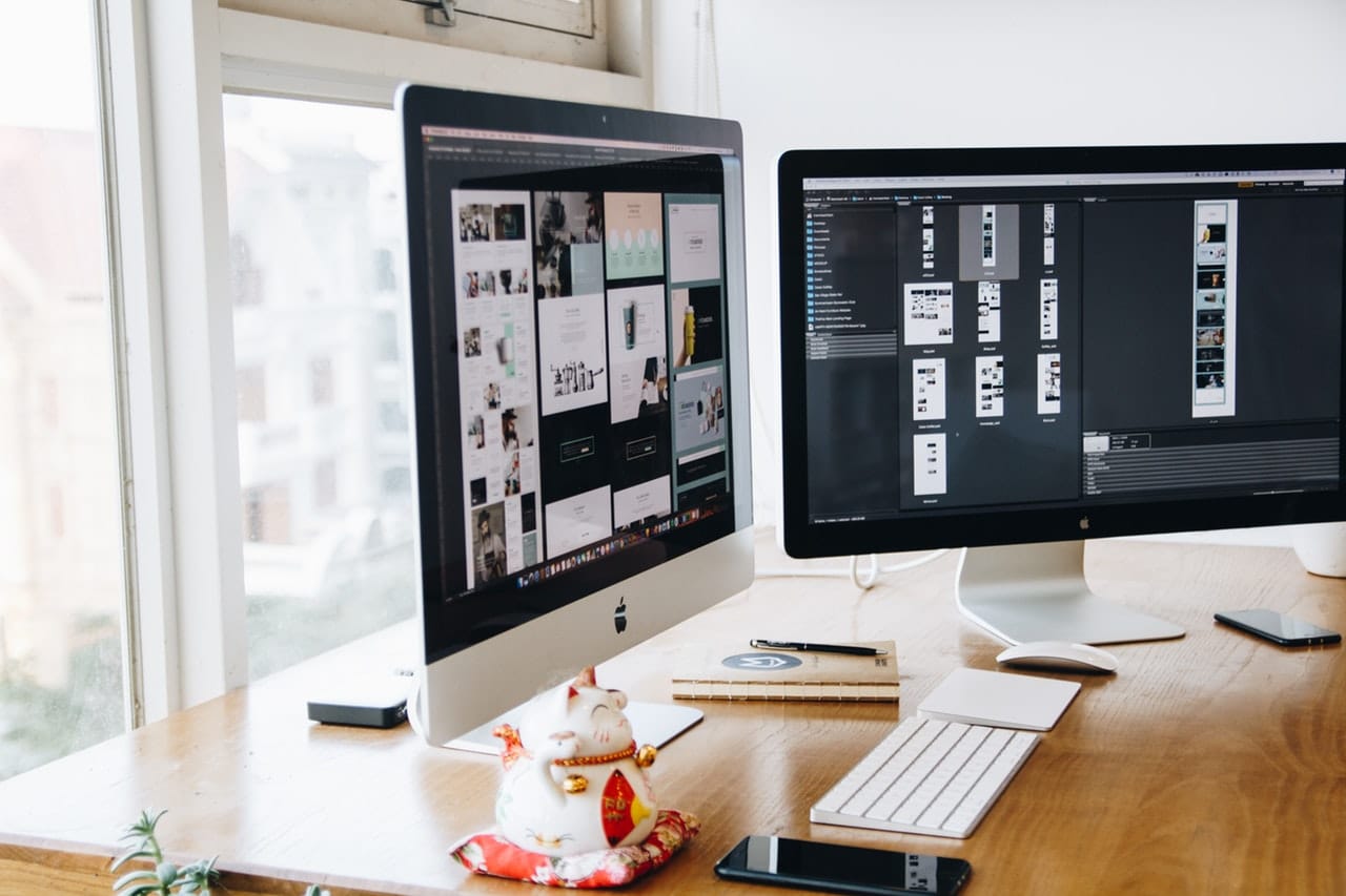
IMAGE: PEXELS
Augmented Reality
Augmented reality (AR) is a cutting-edge technology that allows companies to offer their clients the ease and practicality of interacting with products and services in a lifelike manner. Fashion companies, for instance, are using virtual reality (VR) technology to enable clients to ‘try on’ outfits without having to enter a dressing room. The scope of VR is wide and is currently already being used in the engineering, education, health, and fashion sectors.
Over the next few months, there will be millions of devices that can provide users with a VR experience. Viewers are already able to rotate or zoom web content using touch and drag functions. If you are after a cutting-edge site, important considerations when optimizing the site, including technical training and creativity. Your designers should be able to back their creative talent with the know-how it takes to incorporate technologies like AR or artificial intelligence if these will increase your conversion rate.
Fixed Navigation
This feature allows websites to lock in their menu in place so that it continues to be visible even when the user scrolls down the page. It makes for greater practicality and ease, since users can always get to where they want by clicking on the menu. In one recent study on fixed (or ‘sticky’) vs non-fixed (or ‘non-sticky’) menus, 100% of users stated that they preferred the fixed/sticky version of a site; they were unable to say why, but they noted that sites with this technology were easier to use.
Broken Grid Design
A website’s grid is the foundation that web designers use to create a clean, organized design that is easy for users to interact with. It essentially divides a page into columns or modules that are aligned. Breaking the grid involves creating a more dynamic page through the use of features like animation, ‘accent elements’ such as pictures that change as soon as the mouse touches them, and arrows that expand content and images. The aim of grid design is to add life to a page without hampering the ease and simplicity of the user experience.
Augmented reality, fixed navigation, and broken grid design are just three of many new techniques aimed at making web navigation more entertaining and practical. When designing your own page, it is important to count on professionals who are up-to-date with these techniques, but who can advise you according to the actual needs of your business. Sometimes, a simple grid design works best to relay information about your products and services and simplicity and clarity are key when it comes to keeping customers on your site.
If you are interested in even more design-related articles and information from us here at Bit Rebels then we have a lot to choose from.
COMMENTS