Ever since I watched Hans Rosling’s “The Joy of Stats,” I’ve been thinking more about our world statistics and population. If you haven’t seen it, I highly recommend it. It’s a four-minute augmented reality presentation plotting 120,000 statistics from 200 countries over the past 200 years.
Back in 1810, which is where his presentation begins, most people were poor and sick. The life expectancy was below age 40. Of course, after the Industrial Revolution, things improved. Despite WWI and The Great Depression, things continued to improve worldwide. He points out that even though at times our future looks bleak, with the dawn of green technologies, peace, and several other factors, he predicts we will continue our trend of remarkable progress as a whole. It seems our future is bright after all!
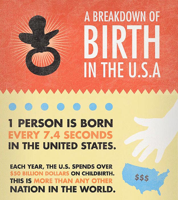
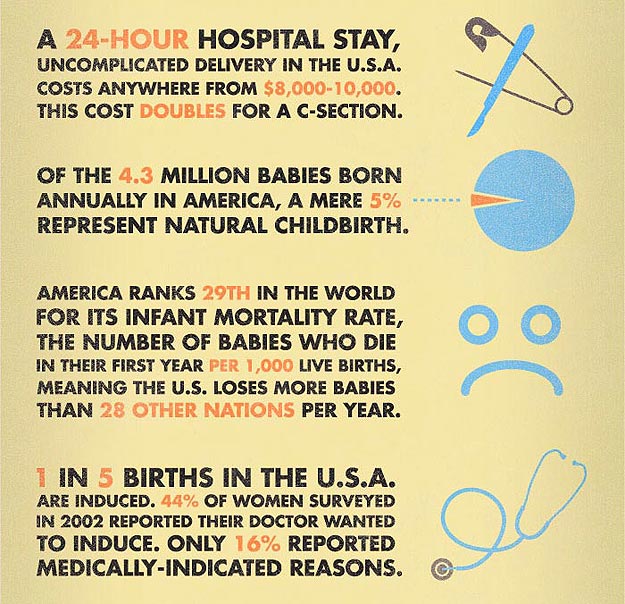
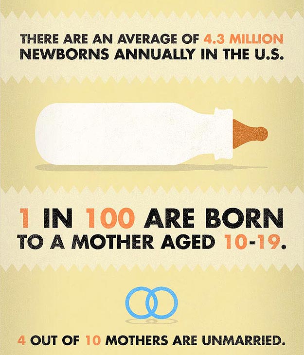
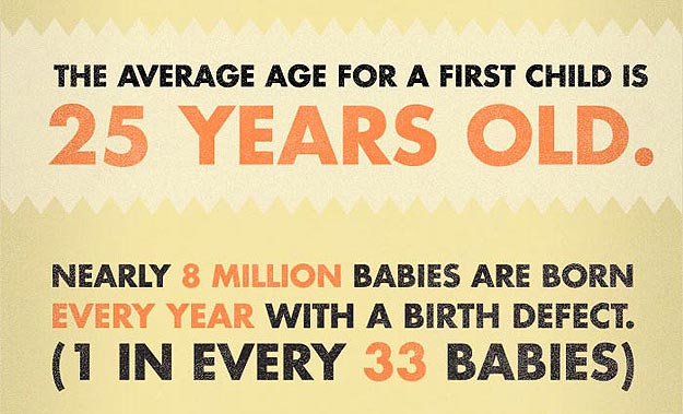
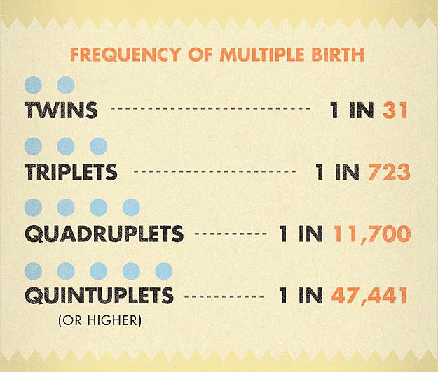
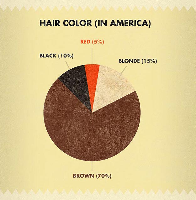
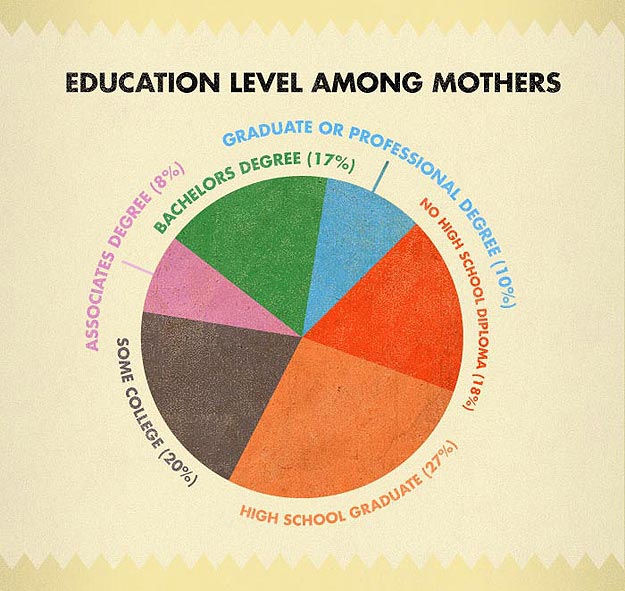
This brings me to thinking about my own country, the United States, and what the growth of the population is here today. I found this brilliant infographic created by Ultrasound Technician. It’s a breakdown of birth statistics in the States. I find it interesting to know that each year the U.S. spends over $50 billion dollars on childbirth, which is more than any other nation in the world. It is also interesting to me that 1 in 5 births here are induced, and only 16% of the time it’s for medical reasons. That probably explains why the costs are so high. My son was due on Christmas Day, and since my doctor didn’t want to work over the holidays, he induced him two weeks early. It’s a decision I didn’t question enough at the time. These stats are presented well, and I hope you enjoy them.
Via: [Unique Daily]

COMMENTS