Categories: Design

Minimalistic vs. Over The Top Transformers 3 Posters

I guess you could say I am not really up-to-date with movies lately, at least the ones that were just released. I especially mean Transformers 3. I have been gearing up to watch that badboy for a while now, and I even made some inquiries in regards to its awesomeness on my Twitter. The reply was, well let’s say, it was more than I had ever expected. It feels I am still answering the replies. My first thought was that I managed to engage pretty much all of my almost 80,000 followers at once by mentioning the Transformers movie. It’s not bad considering that it’s a love vs. hate movie, or so it seems.

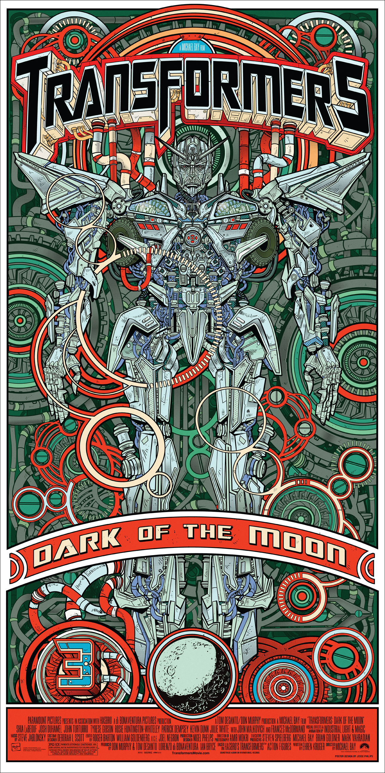
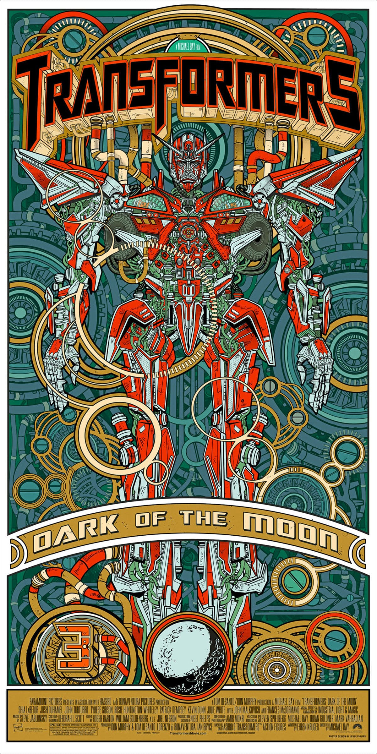
We are once again faced with the decision about whether or not to judge the movie poster. Well, true to our trade, we are going to show you a few new ones designed by various artists who have a different view of the Transformers franchise. Let’s just say they are on different sides of each other. One likes the minimalistic approach, while the other one is all for the over the top approach. Both are of course awesome; however, I think it depends on what your preference is, and it’s here where your part comes in.

First we have Peter Afshar who prefers the minimalistic approach, and his is what you could probably call Tron art. It’s created using just lines to create a couple of Autobots to promote the movie. It’s a brilliant approach that takes a while to create due to the realism he wants to portray in his images. On the other side, we have Jesse Philips, who converted the ordinary Transformers poster into a chaotic scene of gears and gadgets. He makes it all look, well, nothing less than awesome! Once again, the question is what approach do you prefer the best?


Richard Darell

Richard Darell is the founder and CEO of Bit Rebels, a multifaceted online news outlet that reports daily on the latest developments in technology, social media, design and everything geek. Today this media entity welcomes more than 3.5 million unique visitors per month and is considered the go-to place for people in constant motion. As an Internet entrepreneur, he is dedicated to constantly trying to develop new ways to bring content faster and closer to the end user in a more streamlined way. His excitement for statistics has allowed him to further develop systems that continuously produce accurate and fast-paced analytics to better optimize the approach by which Bit Rebels presents news and content. His graphic design background has proven to be an important tool when designing new systems and features for Bit Rebels since the development of solid and stable code depends entirely on their structure and implemented procedures. Richard currently resides in Stockholm, Sweden and directs the Bit Rebels offices in both Stockholm and Atlanta. You can reach Richard at richard@bitrebels.com

Recent Posts

The Unexpected Ways Digital Communities Are Changing Sports Betting Trends

We’ve seen a rise in social gaming sites over the years. These sites, which are…

19 hours ago

Behind The Latest Vaping Designs

The vaping industry continues to evolve, with product designs becoming more sophisticated and user-centric. Modern…

20 hours ago

Pros And Cons Of AI Generated Content: Efficiency And Quality

As digital landscapes evolve, more marketers, content creators, and businesses are asking, what is AI…

21 hours ago

How SEO Services In San Francisco Help Small Businesses Stand Out?

Today, small businesses have an incredible opportunity to grow beyond traditional means and reach new…

2 days ago

The Psychology Behind Competitive Online Gaming: Why We Keep Coming Back

Online competitive games have long been a cultural phenomenon, drawing millions worldwide. From strategic block…

2 days ago

Navigating Global Market Diversity With Dynamic Product Roadmaps

In a world where companies constantly strive to tap into new markets, they also face…

3 days ago