Categories: Social Media

4 Tips To Creatively Style Your Google+ Posts [Infographic]

One thing most social networking services have in common is the inability to do something creative with your posts. We have of course the ASCII way of decorating posts, but those have long since been deemed spam, and if you overuse them you can be pretty sure that you will start losing followers and friends soon. It’s just that there is no real way of being creative when it comes to updating your status and posts. Sure, Facebook allows for you to post images and stuff like that, and so does Twitter, but there is no real way of, for example, styling your post with an easy approach.

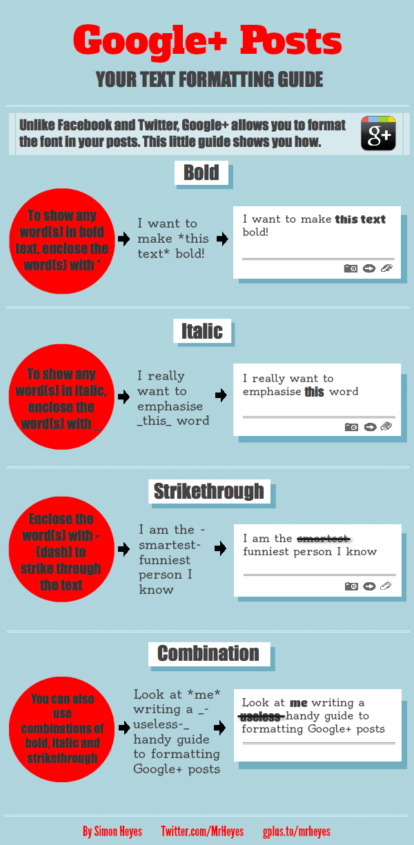
So, is there any social networking service out there that allows styling in the approach that word processors use? Well yes there is! As a matter of fact, one of the newest and most rapidly growing sites is actually doing just that. Google+ has some “brackets” that you can use to style your posts, however it seems most people don’t know about them. In particular, there are 3 ways you can style your posts, and Simon Heyes put them together together a small guide for you all.

It’s not the most extensive guide, but it serves its purpose well. It explains exactly what you need to do and how in order to style your Google+ posts with Bold, Italic or even Strikethrough. Maybe there are more ways to style Google+ posts, and if there are, please don’t hesitate to tell us how in the comment section below. We know there are a ton of people out there looking for a more creative way to get their message across, so it would be greatly appreciated.
Via: [Visual.ly]

Richard Darell

Richard Darell is the founder and CEO of Bit Rebels, a multifaceted online news outlet that reports daily on the latest developments in technology, social media, design and everything geek. Today this media entity welcomes more than 3.5 million unique visitors per month and is considered the go-to place for people in constant motion. As an Internet entrepreneur, he is dedicated to constantly trying to develop new ways to bring content faster and closer to the end user in a more streamlined way. His excitement for statistics has allowed him to further develop systems that continuously produce accurate and fast-paced analytics to better optimize the approach by which Bit Rebels presents news and content. His graphic design background has proven to be an important tool when designing new systems and features for Bit Rebels since the development of solid and stable code depends entirely on their structure and implemented procedures. Richard currently resides in Stockholm, Sweden and directs the Bit Rebels offices in both Stockholm and Atlanta. You can reach Richard at richard@bitrebels.com

Recent Posts

The Unexpected Ways Digital Communities Are Changing Sports Betting Trends

We’ve seen a rise in social gaming sites over the years. These sites, which are…

10 hours ago

Behind The Latest Vaping Designs

The vaping industry continues to evolve, with product designs becoming more sophisticated and user-centric. Modern…

11 hours ago

Pros And Cons Of AI Generated Content: Efficiency And Quality

As digital landscapes evolve, more marketers, content creators, and businesses are asking, what is AI…

12 hours ago

How SEO Services In San Francisco Help Small Businesses Stand Out?

Today, small businesses have an incredible opportunity to grow beyond traditional means and reach new…

2 days ago

The Psychology Behind Competitive Online Gaming: Why We Keep Coming Back

Online competitive games have long been a cultural phenomenon, drawing millions worldwide. From strategic block…

2 days ago

Navigating Global Market Diversity With Dynamic Product Roadmaps

In a world where companies constantly strive to tap into new markets, they also face…

2 days ago