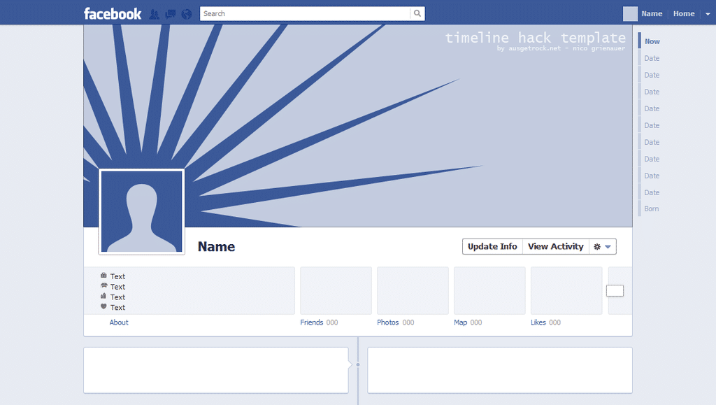
Yup, we are slowly getting accustomed to the new Facebook Timeline and the whole redesign. Personally, I quite like it. It gives us more freedom to pimp it out in various ways, and that is key if you want to be original and impress people with your profile. For all you marketing people out there, this new way of expressing yourself is also a good opportunity to show your genius. I know, my own profile is lame, and I should really do something about it. I need to work up some kind of master plan to redesign my whole header image and see if I can make some good likes that way. But as always, time isn’t exactly growing on coconut trees.
Until now, there hasn’t been too much info or many tutorials about how you could possibly “hack” the Facebook header image and make something really unique. The person to deliver it is Nico Grienauer who writes for Ausgertock. He actually created a template that will give you the freedom to make whatever header image you want, lame or cool, to impress all your friends and subscribers on Facebook.
I have been searching for a good template for this new Facebook profile page that will enable me to “hack” it, visually that is. So now that I have found it, there is no excuse why my profile page looks so darn lame anymore I guess. There are countless numbers of cool, funny examples of new and refreshing profile page designs for the new Timeline design out there. All you have to do is search for it using any of the leading search engines, and you will be presented with tons of great ideas. But as they say, to be original you can’t be a copycat. You have to find your own approach, and when you do, people are definitely going to notice you. Let your creativity flow! You can find the PSD Template over at Ausgetrock.
Via: [Dude Craft]


COMMENTS