The one thing that makes a cell phone a success is probably the user interface. If the UI isn’t user friendly, you can be sure that the phone itself will do no good to the user and most likely won’t become the success the developer wanted it to be. There have been plenty of trials and errors, and they keep emerging every day. What you should keep in mind is that it’s not exactly the easiest of tasks to create a breakthrough user interface. It all has to be done in steps. Some things may seem straight forward to some people, while to others, it’s a junk of complicated maneuvers that will lead to annoyance, and in the end, a change of heart when it comes to the brand and model of the phone.
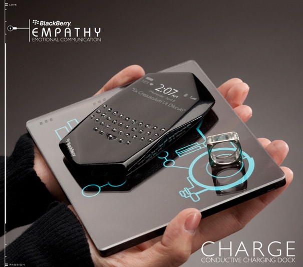
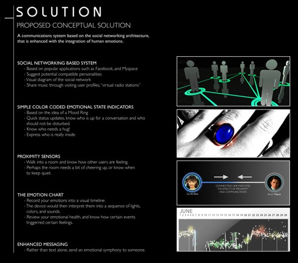
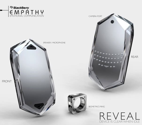
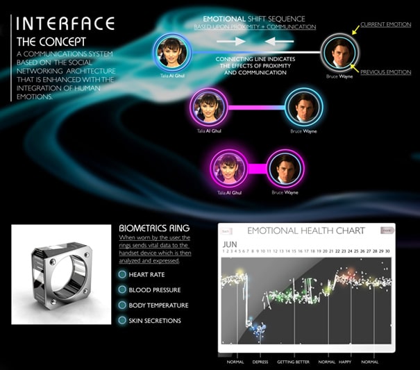
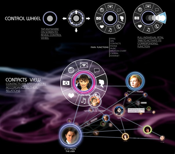
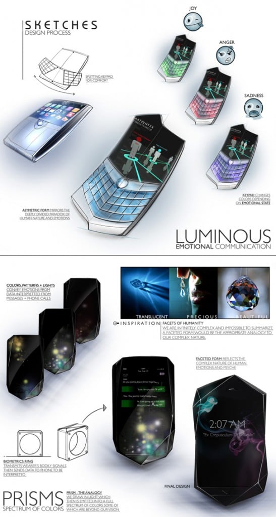
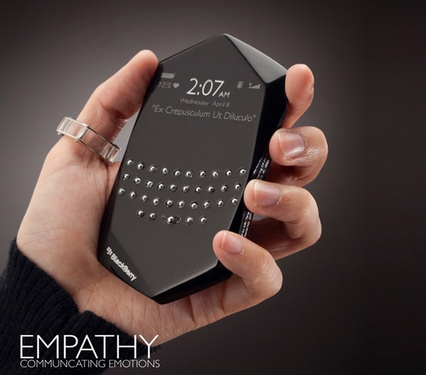
In a sponsored project held by RIM BlackBerry at the Art Center College of Design Kiki Tang & Daniel Yoon decided to have a go at something different. It’s a new and fresh take on the user interface that uses human emotions as a base. It incorporates a finger ring that senses the emotions of the person using the phone, and it reacts accordingly.
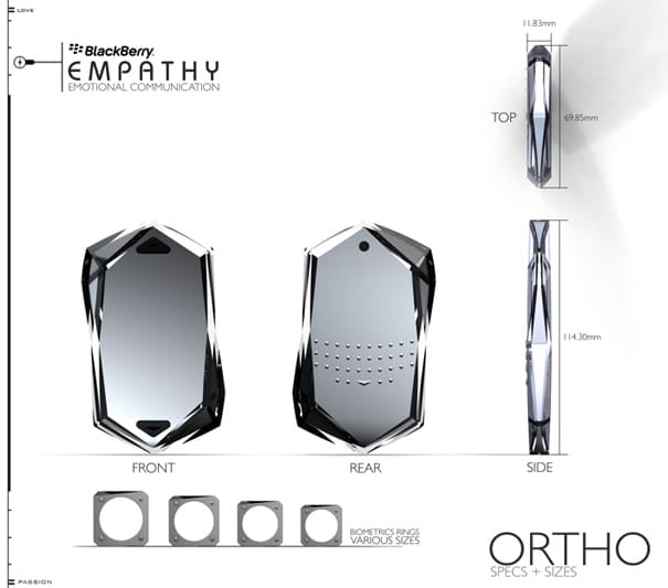
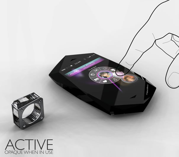
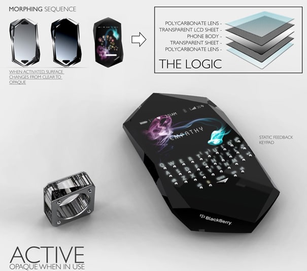
The concept BlackBerry cell phone called “Empathy” will stay transparent if not in use while becoming opaque when in use. The phone itself probably isn’t the most genius of designs, even though I like the images of it. However, it wouldn’t be very comfortable carrying it around. But with an ambition to incorporate everything on it, one side has a touch screen while the opposite side of the cell phone has a keyboard. Pretty nifty. The concept as a whole probably won’t see the light of day, but there are some elements that I think BlackBerry could learn from.
COMMENTS