I don’t think we have covered any topic as thoroughly as we have covered Super Mario. Well, maybe we have with Star Wars or Twitter, but I think Super Mario is one of those subjects that everyone can relate to. If you think about it, who hasn’t played Super Mario at least once in their life, right? We have seen Mario in a slew of different scenarios, and we have even seen him in made up and mashed together game concepts all bundled into one. It’s a really appreciative game to make spoofs out of, and I think that we’ll soon see something new on the game front as well that will throw us all off guard and reinvent this game. Maybe it’s just wishful thinking, but you never know.
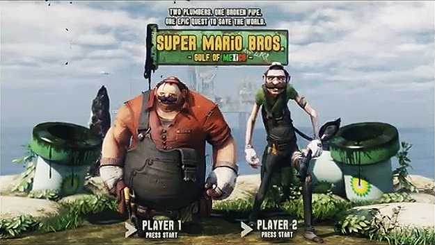
So what do we have here? Imagine a future that is gritty, polluted and ultimately disgusting in nature. Yeah, that shouldn’t be too hard considering we’re well on our way there right now. Now put it all into a Super Mario game concept. What do you have? You definitely have a whole new game to frolic inside. The cool thing is that Jonathan Fletcher, an innovative and skillful artist, put his imagination to good use and created what can only be described as the player selection screen of the future for Super Mario.
It’s a hybrid game intro screen in full video that tends to flirt a little with the oil catastrophe in the Mexican Gulf not too long ago. I guess Mario and Luigi are sent there to make sure things are cleaned up and saved from further pollution by Mr. Koopa himself. It’s a nicely done animation with a lot of soul in it. I wish I could try that game out just to see what the water worlds look like. The castles surely look amazing as well. Consider this to be the eye candy of the day for all you Super Mario lovers.
Via: [Geekologie]

COMMENTS