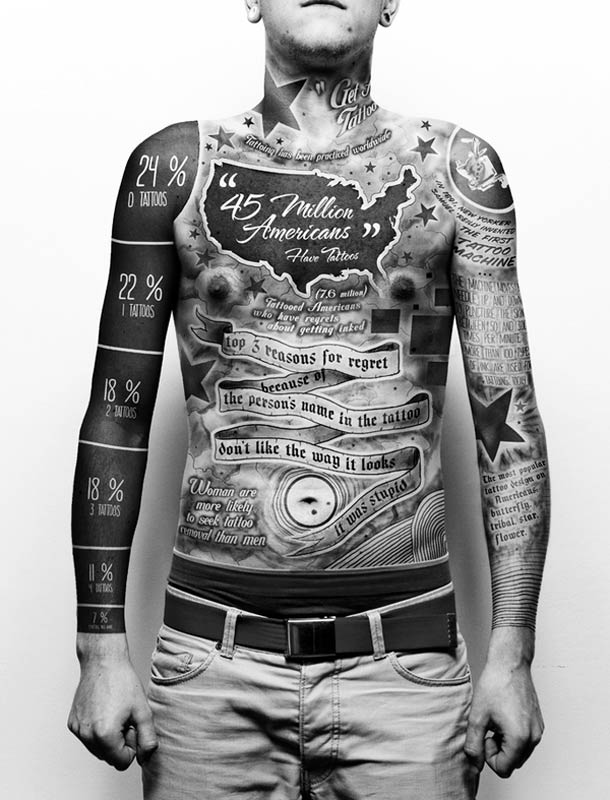
There are some people out there who are downright sick of infographics. I don’t know why, but they are. I can understand that it gets a little overwhelming at times when seemingly everything is made into an infographic and then published on pretty much every website. We here at Bit Rebels try to switch it up a little in order to not get too repetitive. But every once in a while, there comes along an infographic that is not only interesting, but also visually crazy. Usually the format of an infographic is based on ordinary straight forward graphics and layout. There’s not too much to get excited about more than the actual data presented in it.
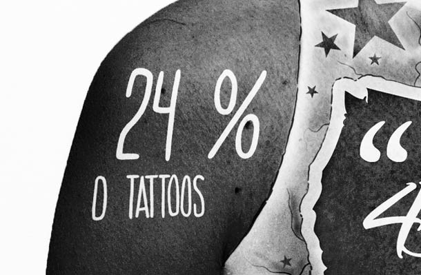
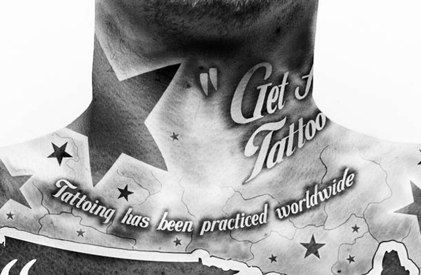
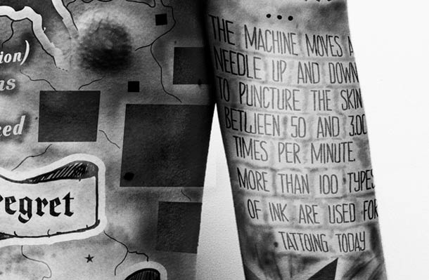
However, there are people out there who have a new approach to all of this. One such person is Paul Marcinkowski who decided that flipping it up a little would be a good idea for his school project. His approach was to make an infographic about tattoos. It’s not just any boring infographic though since it’s actually done by tattoos! Don’t get too crazy now because of course they are not real tattoos, they are just a creation made in Photoshop.
It looks really good though, and it is by far the coolest infographic I have seen to date. It’s really well done also. I find myself wondering what grade he must have gotten for this badboy since it must have been the coolest project in his class pretty much. Now, hopefully infographic designers of the world have gotten a boost of inspiration so they can start making up some new concepts for how an infographic should look. Even though I haven’t gotten tired of infographics just yet, I still feel they are becoming a little bit too repetitive in their format.
Via: [UFunk – French]


COMMENTS