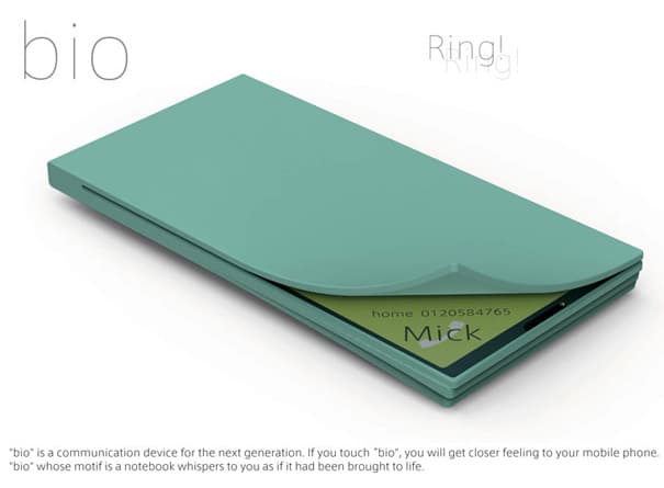
Designs are meant to give us a better and more user friendly way of using our gear. The more straight forward the design is, the more likely it is that the gadget will work commercially and become the success every company is hoping for. But to create a sleek design is anything but easy, and it takes several redesigns and brainstorming processes before the final and ultimately working design is presented to the people that are supposed to produce it. If a design isn’t in line with the current technology hype or the look, it’s hard to make it a success. We have seen many examples of that in the console industry. I couldn’t tell you how many people have tried and failed when launching a new gaming console, and if you look at the successful ones, you will notice a clear and undeniable pattern. They are all ahead of the game when it comes to design, quality of graphics and also user interfaces.
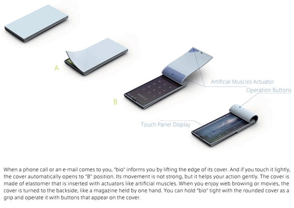
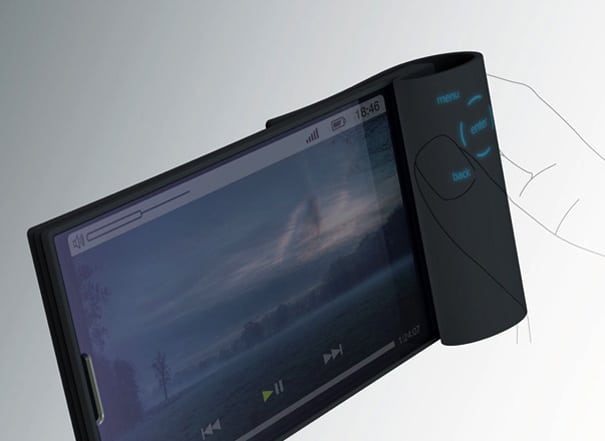
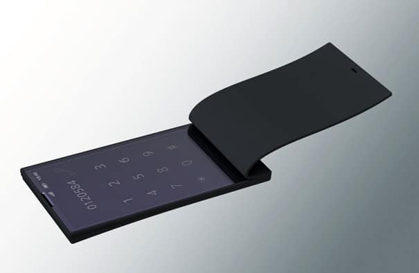
So when I look at the Bio Phone, I get a sense of too much trying and too little thinking. With that, of course I mean that the way new features are thought up is exaggerated and on the borderline of being unusable. The idea wouldn’t be so bad if it were a desktop phone, but as a cell phone, I just don’t know.
If you have a phone in your pocket, I am sure you wouldn’t want it to corner up at the edge. That would make it not only uncomfortable, but could also lead to some really awkward situations. People that know me know that I am not too fast in eliminating designs, and I am sure this one has its purposes. But as a cell phone… well, I’m not sure. Designers: Miyazawa Tetsu and Ichimura Shigenori


COMMENTS